The last few MACH projects I've worked on have implemented differing solutions to serving images on websites. I wanted to get to the bottom of image optimization and see what really made a difference, so I decided to compare the standard html img tag, the Next Image component, the React Image component from Dato CMS, and the Cloudinary Next Image component.
<img>
The simplest way you can provide an image to a website is by using the html image tag. You can pass it the url of the image to the 'src' prop and it will display the image. However, this is completely unoptimized, as it will choose just one image to span all breakpoints and scenarios, which is not ideal. You can of course create your own 'srcset' which is a list of breakpoints with appropriate urls to images of different sizes. That way the browser can decide which image to serve under which condition. To do this though, would require quite a bit of configuration, not to mention requests to your CMS for all the image urls at the different breakpoints. A lot of faff, and not particularly streamlined for developers to build components with.
<DatoImage>
The CMS behind this blog is DatoCMS and one of my personal favourites due to its no-nonsense developer experience. Dato have built their own image component for React which is designed to work with the image objects that come out of their api. You simply pass that response object that includes a srcset, from the api to the component, and it converts that directly into a html picture element that will serve images at different pixel widths. Out of the box, it also has a nice blur-to-clear animation for the lazy loading of the images, which means you don't have to craft any intersection observer components yourself.
If your site isn't doing too much visually speaking, like this blog for example, Dato's React image component is a reasonable option. You get quite a lot of nice features for free and with almost zero config. If you're using their CMS too then it's a no-brainer to make use of this. However, the srcset the CMS provides is somewhat lacking in its nuance as they don't provide as many options in their srcset. This is maybe not as good as it could be as you'll see with the Next Image...
<NextImage>
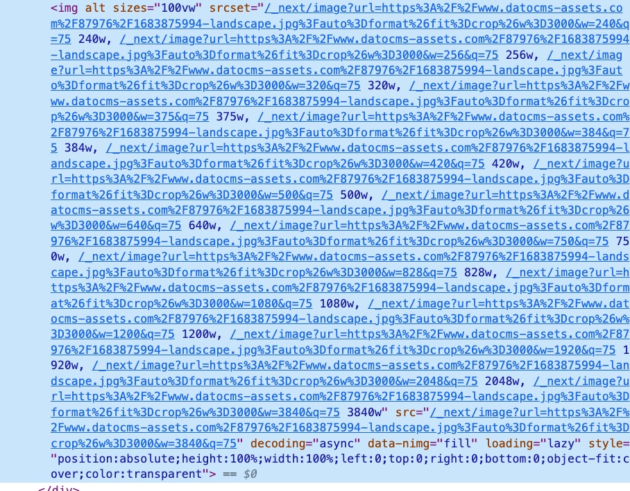
The Next image component works slightly different to what we've seen before. It's not just a wrapper to the native img or picture elements, but also generates different sizes of image based on a source image and stores them locally to the project on the server. Using that location it will generate a substantial srcset for the img element with 15 different pixel widths. This is clearly quite a powerful option, as all you need to do is provide it with the url to the most high res version of your image in the CMS and it will do all the resizing for yourself.

The Next Image will also automatically lazily load the images by default. Another nice feature is you can set a priority prop on the component for image that needs to take precedent in loading over all others. The only thing that I find lacking with this component is the lack of a default transition effect for the placeholder. After using Dato's React Image component it makes you realise you want that effect on everything.
<CldImage>
The Cloudinary option is really just a wrapper around the Next Image component. With this however, you get the option to further optimize the images by sending the urls to the Cloudinary api, which will in turn return you a srcset with optimized images. It can do all manner of fancy things like auto crop using AI, add effects and filters to the image, all by just passing props to the component, which will feed the api.
If you have a legacy source for your images that is hard to migrate, this could be an ideal solution to improve the performance of an existing website. Just by feeding the component the url for the old image, would provide you with a super optimized version of it. However, you should be aware that every time you hit that api endpoint, you will be using up your conversion credits with Cloudinary, and at some point they will start cashing in.
Art Direction
An idea that is often floated as a solution to image optimization is that of art direction. This is the ability to supply the browser with more than one image for different scenarios. For example, on mobile, a full screen image for a hero component would be more portrait than landscape. Using a landscape image on mobile would result in much of the image being cropped. All those cropped pixels are wasted data that's being delivered but not actually being displayed. So perhaps if we supply an image that has a portrait type aspect ratio there would be less cropping, and less wasted data.
I tested this with the Next Image component, supplying two different images, one for portrait and one for landscape. What I found was the landscape image was smaller per kb at every pixel width, whereas the portrait image was often double the size. After some initial confusion, I realised this was because it was working on the widths of the images, so the landscape image that was half the height of the portrait image, was being reduced to the same width, and consequently rendered a smaller image overall. The portrait image maximised the space instead.
Because of this effect, you might notice that landscape images on mobile that are filling the entire viewport are more blurry than you expect them to be. By supplying the mobile viewport with an image maximised for that viewport, all the data for it will be in view, nothing will be stretched to fill like the landscape version. Hence, this would be a good scenario to choose art direction as an add-on.
During this investigation, I have also noticed that many of the pixel width breakpoints will occur during the mobile resolution range, and very few in the desktop. This can be considered to be fairly reasonable, as you might expect desktop machines to have higher powered CPUs and better internet connections, and therefore image size is less of an issue. But what if the user has a retina monitor, perhaps with 3800 pixels or more? The srcsets will be giving the same image for a monitor at 1200px as that at 3800px, and clearly that higher res monitor will be rendering an image that needs to stretch and alias. So you could set a super high definition image in the CMS then use one of the above components to give a srcset that would span the upper echelons of screen resolutions.
Conclusion
If you have little time to investigate what your project really needs in terms of image optimization, just go for the Next Image component. It will give you pretty much all you need, and if you find it lacking at some point you can augment it fairly easily.
For the next big project though, I'm thinking to create an image component, that will be essentially a wrapper that can take a mobile portrait image, a standard landscape image, and a high definition landscape image. That way, it can really improve the user experience for all cases for images that go into hero type components.
More Reading on this...
How to use Next Image component:
https://medium.com/eincode/how-to-use-next-js-image-component-dfbf3725b12
Adding art direction as a feature to the Next Image component:
https://github.com/vercel/next.js/discussions/26728
Optimizing for High Density Displays:
https://jakearchibald.com/2021/serving-sharp-images-to-high-density-screens/
Setting heights and widths in images:
https://www.smashingmagazine.com/2020/03/setting-height-width-images-important-again/
