
In the last few projects I've seen several different style packages employed to manage how classes will be associated with respective React components. The two main ones have been styled-components and classnames and until now I've not had an opportunity to compare them properly and explore their pros and cons.
Classnames
classnames is a small and well established package that conditionally joins classNames together. Typically you would have your styles in a separate index.module.scss file in the same folder as the component. Then in the component file you would import the .scss file, the classnames package, and create a const with a short name:
    import classNames from "classnames/bind";
    import styles from "./index.module.scss";
    const cn = classNames.bind(styles);
Then you would reuse that const throughout your component, like this:
<div className={cn("wrapper")}>
...
</div>
Something you'll want to do a lot of is be able to attach a certain class to an element upon a particular condition. A common use case for this could be a link that when active, different properties are applied to it. You can do that quite easily like this:
<li className={cn("link", { active })}>
then in your index.module.scss file you would have a class called `.active` with all the properties you wish to give it when the active prop is `true`.
A way to keep your component code cleaner is to set any of these conditional props at the top level. That top level is usually called the `wrapper`:
<div className={cn(className, "wrapper", { active })}>
Then in your index.module.scss file you can select for the element you wish the active class to be associated with like this:
.wrapper {position: relative;&.active {.link {color: gold;}}}
This basically selects any element that has the .wrapper AND .active class, and applies the color gold to an element anywhere below it that has the .link class.
You will notice also, that there is a prop called 'className' being passed to the `cn` function. This is also configured at the top level in the component, usually on the wrapper, so that any parent can pass down a class and have it applied.
You cannot, as far as I'm aware, pass dynamic props down to the classes. For example, if you wanted to set the source for a background image on a div, you would normally do this with css, but maybe you wouldn't want to hardcode it. The only way you could do this if you were using classnames, is to set an inline style on the element like this:
<div className={cn(className, "wrapper", { active })} style={{ backgroundImage: `url(${backgroundImageSrc})` }}>
)}>
And further up in the component you could define the background image source:
const backgroundImageSrc = "https://www.images.com/793.jpg";
Now let's see how styled-components fair with similar tasks...
Styled Components
styled-components works by using template literals to lay out all the css you wish to give an element, but with all the javascript syntax and functionality you're accustomed to.
You can write your consts directly at the top of the component file or separate them out into a separate .js | .ts file then import them. Either way, this is what they would look like:
import styled from 'styled-components';
export const Wrapper = styled.div`
  position: relative;
  `;
Then in your component file you would use it like any other component:
<Wrapper>...
</Wrapper>
If you wanted to pass an 'active' prop down to a link const for example, you would do it first like this in the component:
<Link $active >...</Link>
Then define the const like this:
const Link = styled.div`background: white;color: red;${props => props.$active && css`background: red;color: white;`}`;
And if you wanted to pass down a dynamic value as a prop to the classes, you could do it like this:
const backgroundImageSrc = "https://www.images.com/793.jpg";<Wrapper $bgImgSrc={backgroundImageSrc>...
Then in the styles.ts:
export const Wrapper = styled.div<{ $bgImgSrc: string }>`
  ...
  ${props => props.$bgImgSrc && ` background-image: url(${props.$bgImgSrc}); `}
`;
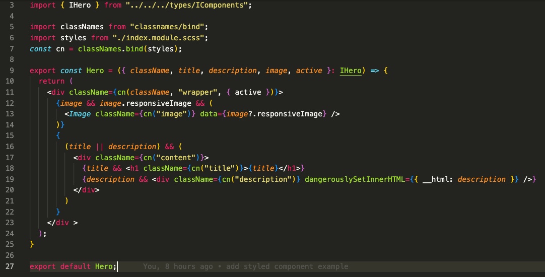
So you see you can almost do the same thing with both packages, it's maybe just a case of aesthetics for the developer making the decision. Comparing the JSX between the two is worth doing. Here is the component with classnames:
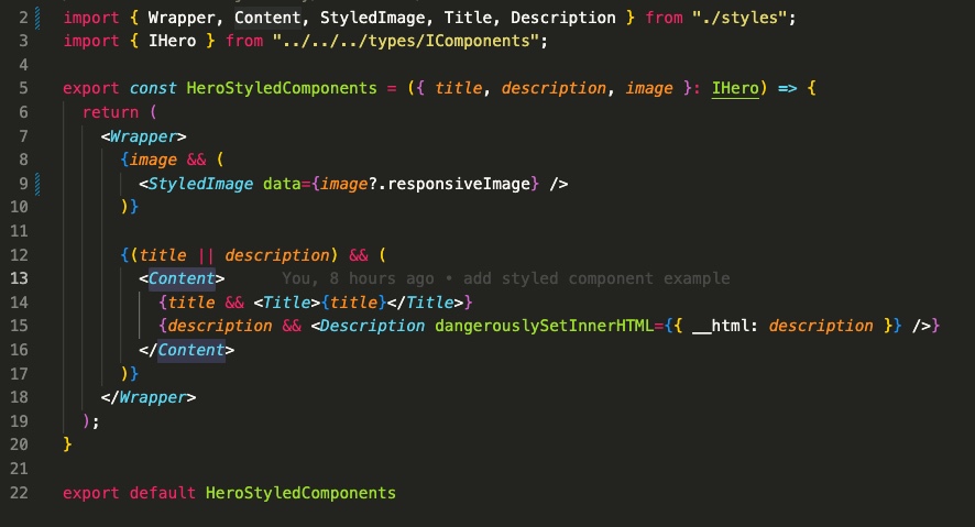
And here's the component with styled-components:
Conclusion
styled-components is definitely more readable from the component view. All of those classnames are abstracted away into effectively another component, keeping the code much cleaner. However, there's a part of me that feels like that's a step too far. It's easy to forget we're actually building with html elements when they're hidden away like that.
Also, whilst it does give the developer more flexibility with passing values down to the classes, I wonder if that's really a good thing. Sure, it's great if you have an edge case where you need it, but it could lead to an abuse of power, where component design suffers, not to mention readability in the styles themselves.
It's difficult to come down off the fence in favour of one over the other. I like that styled-components is more React-y and readable, but after working with classnames in a formulaic best-practice way, you can get pretty used to them, and their limits can help you maintain a consistent component structure.